By Ben Schachne
A Look at the Best Posters from the 2005–2015 Broadway Seasons
Before the curtain rises, a Broadway production’s first and most important challenge is attracting an audience. While reviews and word of mouth can build interest, a show’s most immediate marketing tool is often their key art. A successful design captures the essence, artistic identity, and story of a production in a single image that can command attention on a billboard, magazine, or social media feed.
From 2005 to 2015, Broadway key art reflected an increasingly diverse range of design approaches, blending traditional illustration and expressive typography with photography, minimalism, and increasingly conceptual imagery. Here are the best posters from the 2005–2015 Broadway seasons.
2014–2015: Something Rotten!
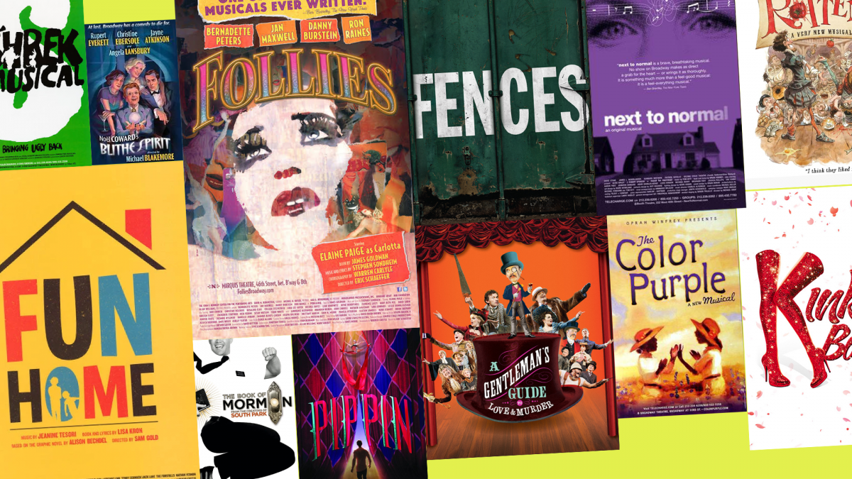
This poster communicates its Renaissance setting and theatrical style almost immediately. The exaggerated Shakespearean imagery and whimsical typography convey the grandeur of the Elizabethan stage while playfully signaling the musical’s irreverent take on the Bard and his work. The detailed composition and tongue-in-cheek visual style instantly capture the musical’s rich theatricality, comedic absurdity, and satirical examination of the Renaissance and show business.
What We Love: It sets the tone perfectly
Honorable Mentions: Fun Home & The King and I
2013–2014: A Gentleman’s Guide to Love and Murder
The old-fashioned-looking composition, ornate typography, and repeated imagery of the various D’Ysquith heirs create a visual sense of farce, inheritance, and impending death without needing a complicated explanation. The boldly bright orange backdrop beams off the design and stands out anywhere. The design also fits the production’s overall aesthetic of stylized period design.
What We Love: It guarantees a fun time
Honorable Mentions: After Midnight & Violet
2012–2013: Pippin
This poster completely reinvents and separates itself from the original production’s design. This key art trades the iconic typography and simplicity for oversized red and teal typography and rich red and blue harlequin curtains which immediately evoke the spectacle and tradition of the circus. The dramatic stage imagery with the title character in the spotlight and the performer emerging from the top of the frame reflects the revival’s fusion of circus acrobatics, theatrical illusion, and Fosse-inspired performance, capturing Pippin’s search for something extraordinary.
What We Love: This new logo is extraordinary
Honorable Mentions: Kinky Boots & Cinderella
2011–2012: Follies
The layered collage of faded photographs, glamorous showgirls, and torn paper feels nostalgic, fragmented, and distorted, perfectly capturing a world consumed by memories of its past. The iconic youthful face remains at the forefront, yet updated with a thematically fitting design including faces that overlap and disappear into one another, visually representing the musical’s central tension between who the characters once were and who they have become.
What We Love: It reinvents a classic
Honorable Mentions: Newsies & Spider-Man: Turn Off the Dark
2010–2011: The Book of Mormon
The minimalist black-and-white design, missionary figure, and enormous doorbell typography create an immediately recognizable visual. The design cleverly plays with the visual language of religious literature while simultaneously making the show’s irreverent comedy apparent. Its visual concept is so immediately clever that you can explain the entire marketing strategy almost entirely through the poster’s composition.
What We Love: It joyously subverts expectations
Honorable Mentions: Anything Goes & Catch Me If You Can
2009–2010: Fences
The poster’s weathered, earthy visual style and image of a green fence are extremely simple but effective. The fence functions literally as the title while also symbolizing the emotional barriers, racial divisions, and boundaries that shape Troy Maxson’s life. The green color scheme reflects the green garbageman jumpsuit Troy wears on stage, with the bold, painted typography in all-caps at the center of the image, reflecting the themes of the fence and the designs of the past.
What We Love: Its bold simplicity
Honorable Mentions: Superior Donuts & Finian’s Rainbow
2008–2009: Next to Normal
The monochromatic purple palette and halftone portrait of Diana’s eyes create an intimate yet unsettling image, while the suburban houses beneath her suggest the seemingly ordinary world hiding beneath her psychological struggles. The color purple is often associated with themes of the subconscious and hidden emotions, while the fading title alludes to Diana’s fading sense of self, making the poster’s visual hierarchy a representation of the show’s themes of family, grief, and mental illness.
What We Love: The hidden messaging
Honorable Mentions: Shrek the Musical & Blithe Spirit
2007–2008: In the Heights
The colorful, densely layered image captures the energy, diversity, and sense of community that define Washington Heights and the story of the show. Each individual figure feels distinct and meaningful, celebrating the neighborhood’s rich culture and the people who call it home. Combined with bold typography and warm colors, the imagery resembles a nostalgic mural or street collage, reflecting the show’s celebration of culture, family, and belonging.
What We Love: The sense of community
Honorable Mentions: South Pacific & Cyrano de Bergerac
2006–2007: Spring Awakening
The vintage photography, bold red stamped title treatment, and youthful figures create a raw, rebellious aesthetic that immediately challenges the polished look of traditional musical theater. The imagery of young people reaching toward one another captures the show’s themes of adolescence, desire, repression, and the struggle to break free from the expectations of society. The key art has a very distinctive visual language that immediately communicates the collision between a restrictive historical world and modern rock music.
What We Love: It redefined Broadway art
Honorable Mentions: Company & The Coast of Utopia
2005–2006: The Color Purple
The deep purple typography and floral imagery connect directly to the title while evoking the themes of nature, resilience, growth, and transformation that define Celie’s journey. The contrasting purple and yellow palette creates a visual tension through their complementary relationship, mirroring Celie’s internal struggles and the discrimination and abuse she endures. The hand-painted aesthetic and organic composition add warmth and spirituality, reflecting the show’s exploration of identity, family, love, and strength through adversity.
What We Love: The rich painterly colors
Honorable Mentions: The Drowsy Chaperone & Absurd Person Singular