A Look at the Posters Behind the 2026 Tony Nominees
Before audiences fell in love with these productions, they fell in love with an image. A Broadway poster has one job: stop someone in Times Square, on Instagram, or flipping through a Playbill and convince them to lean in. The best key art truly becomes part of the show’s identity.
This year’s Tony nominees offer a fascinating mix of approaches, from bold typography and conceptual design to celebrity photography and illustration. Here are the posters that helped define Broadway’s season.
Ragtime
Perhaps the boldest piece of graphic design among this year’s nominees. The blazing red background and towering white typography feel urgent, revolutionary, and impossible to ignore. The Statue of Liberty torch instantly evokes immigration, America, and social change, all central themes of the musical.
What We Love: This timeless design would have worked in 1998 or 2026.
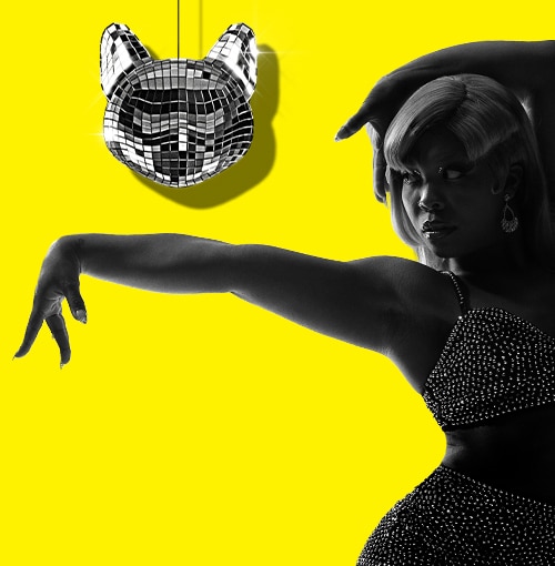
Cats: The Jellicle Ball
This is arguably the most successful reimagining of existing Broadway branding in years.
The original Cats logo with its piercing yellow eyes is iconic, but this campaign boldly reinvents it through ballroom culture. The electric yellow, striking pose, and disco-ball cat head instantly communicate that this isn’t a revival interested in nostalgia.
What We Love: It reinvents a brand without losing its identity. Purrrfect.


The Lost Boys
The rich darkness and flash of color instantly set a mood. The glowing hand feels supernatural, seductive, and dangerous. It doesn’t explain itself, which is exactly why it works. The campaign understands something many horror-inspired productions miss: mystery is often more powerful than information.
What We Love: It feels like a prestige film poster.
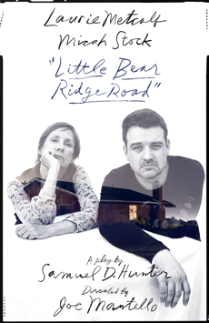
Little Bear Ridge Road
This subtle poster is one of the season’s most human. The handwritten typography, monochrome portraits, and glowing house suggest intimacy, family, and emotional complexity. Nothing here is flashy, and that’s precisely the point.
What We Love: It feels deeply personal.
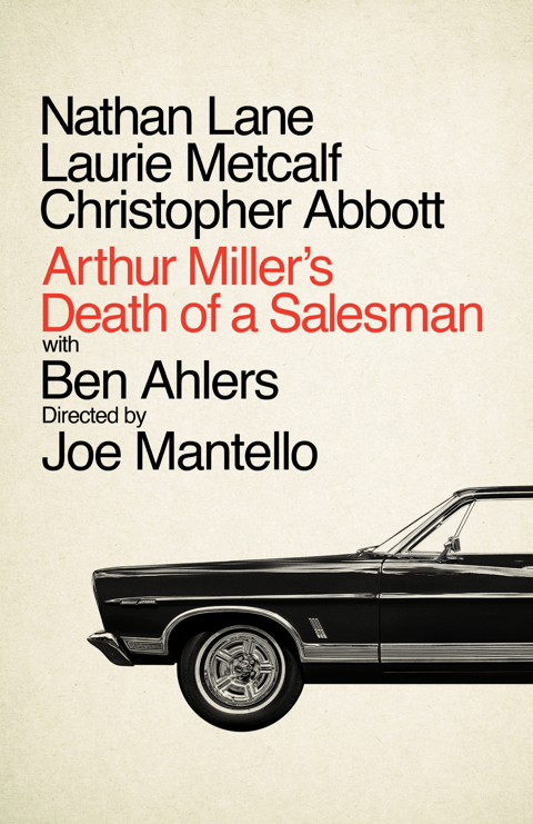
Arthur Miller’s Death of a Salesman
This poster demonstrates extraordinary restraint, especially by not showing the faces of its stars. Typography and a classic automobile are all it needs because the design understands that Arthur Miller’s title already carries enormous cultural weight.
What We Love: Confidence through simplicity.
The Rocky Horror Show
Some logos are simply too powerful to abandon. The dripping blood-red mark remains one of theatre’s most recognizable visual identities. This production wisely leans into that legacy while modernizing the surrounding design.
What We Love: It understands the value of an icon.

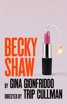
Becky Shaw
At first glance, it’s simply a tube of lipstick. Then you notice the wick. Then the spark. Suddenly the lipstick has become a stick of dynamite.
What’s especially impressive is how economical the design is: no cast photo, no scenic image, no explanatory tagline; just one single object. That’s often the mark of truly great key art.
What We Love: The entire play is hidden inside a single visual metaphor.
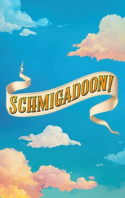
Schmigadoon!
This poster is charming. The embroidered ribbon floating through a bright blue sky immediately evokes classic musical theatre while still feeling fresh and contemporary. Rather than parodying Golden Age musicals, the design lovingly celebrates them.
What We Love: It captures optimism without becoming cheesy.
The Balusters
The quirky illustration of a collapsing townhouse packed with eccentric characters immediately communicates comedy, chaos, and social satire. The visual gag lands before the audience even knows what the play is about.
What We Love: The illustration explains it all.
Oedipus
The flashing cameras surrounding Mark Strong and Lesley Manville transform an ancient tragedy into a modern story about public scrutiny, celebrity, and downfall. The design cleverly uses contemporary imagery to illuminate timeless themes.
What We Love: It modernizes Greek tragedy without losing its weight.

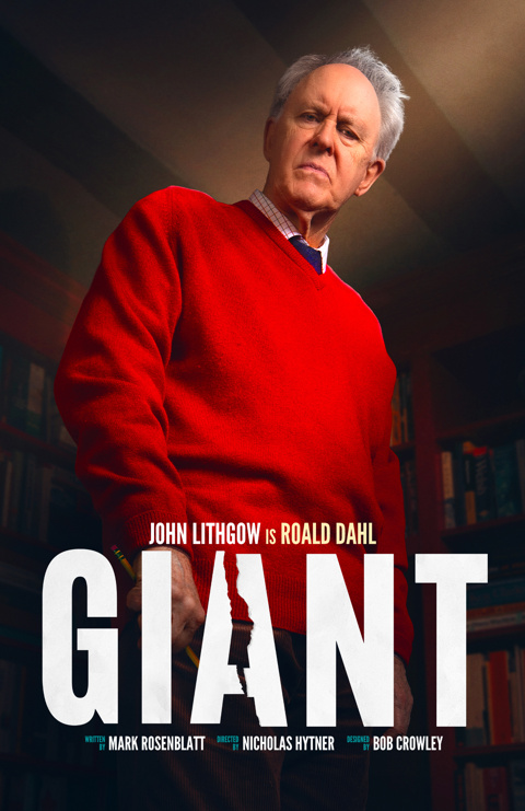
Giant
This artwork is a masterclass in celebrity storytelling. John Lithgow’s “giant” imposing presence dominates the image, but the real brilliance lies in the details. The torn silhouette embedded within the title hints at the complicated legacy of Roald Dahl, creating tension beneath the straightforward star portrait.
What We Love: It turns a famous face into a thematic statement.
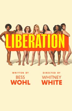
Liberation
The oversized yellow typography dominates the composition with the confidence of a protest sign. The design feels rooted in feminist activism while remaining contemporary and clean. It’s simple, direct, and impossible to miss.
What We Love: The poster itself feels political.
Chess
This is star-driven marketing executed with precision. Aaron Tveit, Lea Michele, and Nicholas Christopher are photographed like fashion icons, creating a sleek and glamorous image that mirrors the high-stakes world of the musical itself. The hot pink title treatment slices through the monochromatic photography.
What We Love: Broadway glamour at its most unapologetic.
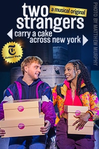
Two Strangers (Carry a Cake Across New York)
This poster tells the audience exactly what kind of night they’re about to have. Bright colors, immediate chemistry, and a giant title that practically becomes part of the New York skyline. The cake boxes are part of the plot. Also, a rare occurrence that we see a show poster that uses production photography.
What We Love: It sells character before concept.
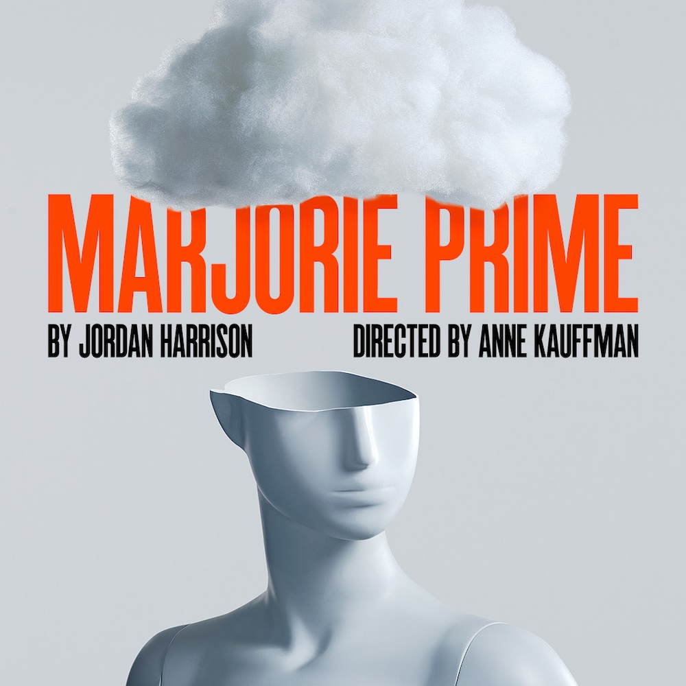
Marjorie Prime
Another great example of minimalism and restraint. The faceless figure beneath a cloud communicates memory and identity. The image is elegant, unsettling, and intellectually engaging all at once. It also fits in well as part of Second Stage Theatre’s season with Becky Shaw’s artwork.
What We Love: It trusts the audience to do some of the work.